Before you start:
A project with completed workflow steps (through platform selection)
What you'll have at the end:
A fully customized design preview with your preferred theme, layout, and page configuration — ready for code generation.
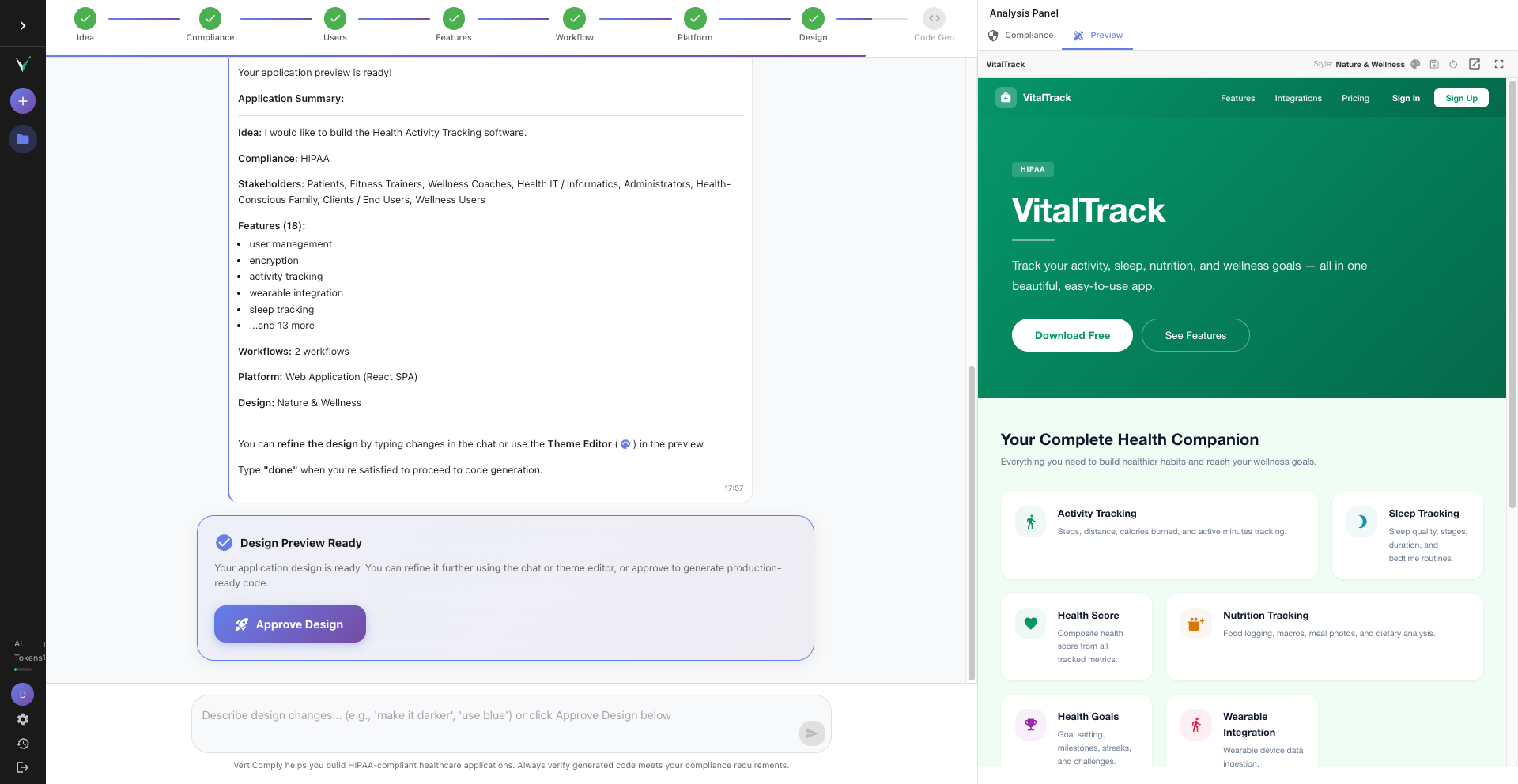
Open the design preview
The design preview appears automatically in the right panel after you complete the platform selection step. If you do not see it, click the "Preview" tab in the right panel. The preview shows a live simulation of your application with real navigation, pages, and data.
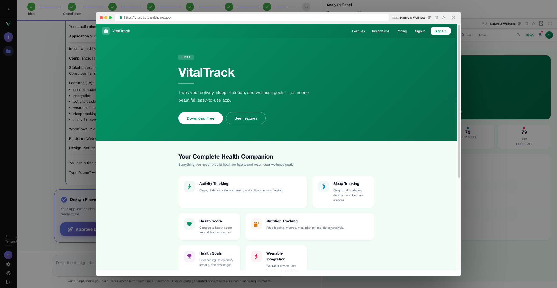
The right panel showing the Preview tab selected with a healthcare application dashboard visible
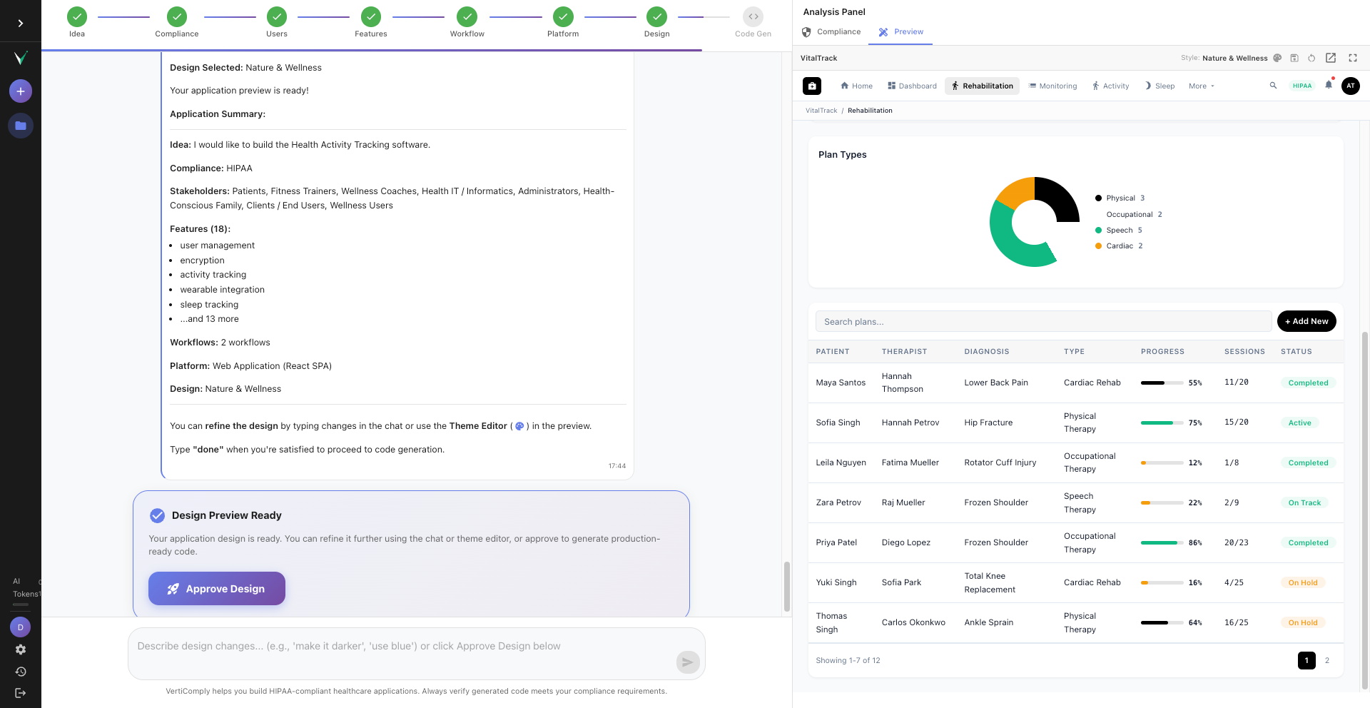
Navigate between pages
The preview includes a sidebar (or top navigation depending on layout) with all the pages your app will have. Click through Dashboard, Patient Management, Appointments, Settings, and other pages generated from your selected features. Each page shows the exact section layout — KPI cards, data tables, charts, forms — that will be in your generated code.
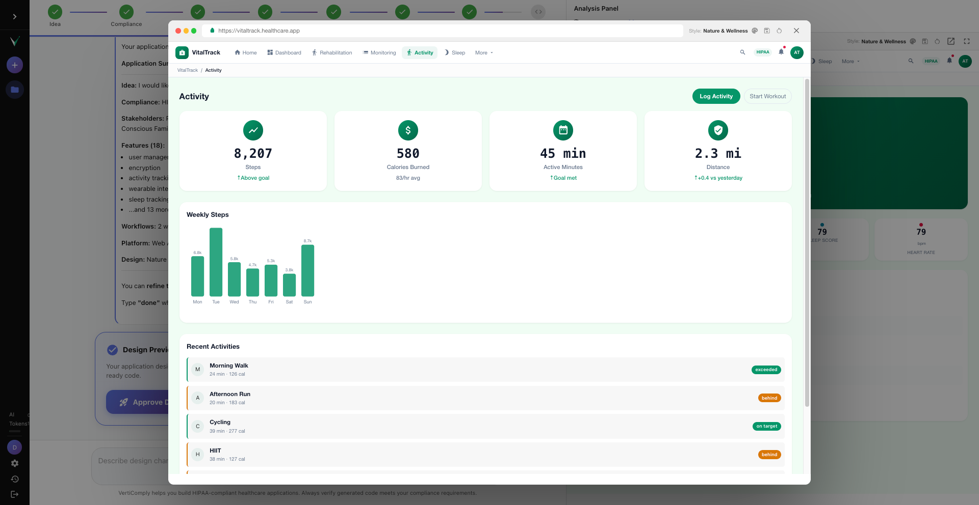
Preview sidebar showing navigation items: Dashboard, Patients, Appointments, Prescriptions, Lab Results, Settings with the Patients page active
Tip: Every navigation item becomes a real route and page component in the generated code. If a page is missing, go back and add the corresponding feature.
Switch design themes
Click the theme selector at the top of the preview. VertiComply offers multiple design styles — Modern Minimal, Clinical Professional, Warm Organic, Bold Vibrant, and more. Each theme changes colors, typography, card styles, and the overall feel. The theme you select becomes the exact color palette in your generated code.
Theme selector dropdown showing Modern Minimal, Clinical Professional, Warm Organic options with the preview updating in real-time
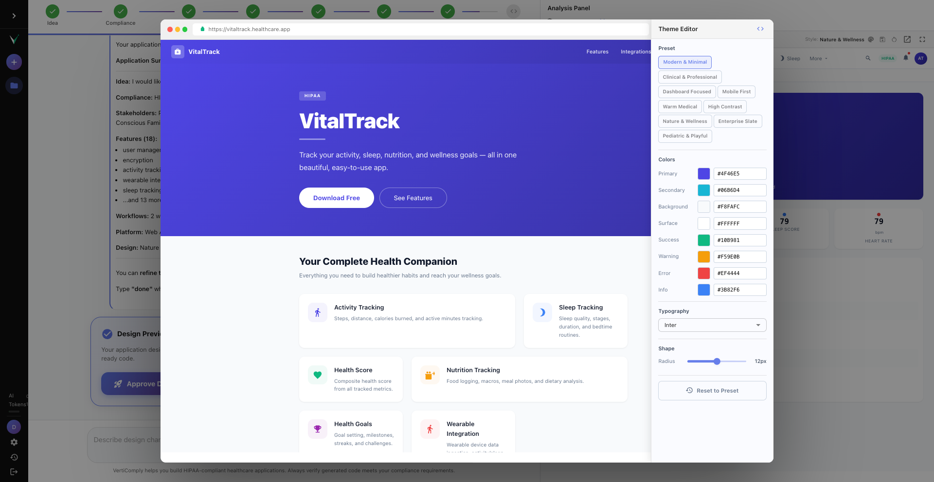
Customize the theme editor
For fine-grained control, open the Theme Editor. Here you can adjust individual colors — primary, secondary, background, sidebar, text — as well as font family, border radius, card style (elevated, outlined, flat), and button style (rounded, sharp, pill). Changes update the preview in real-time.
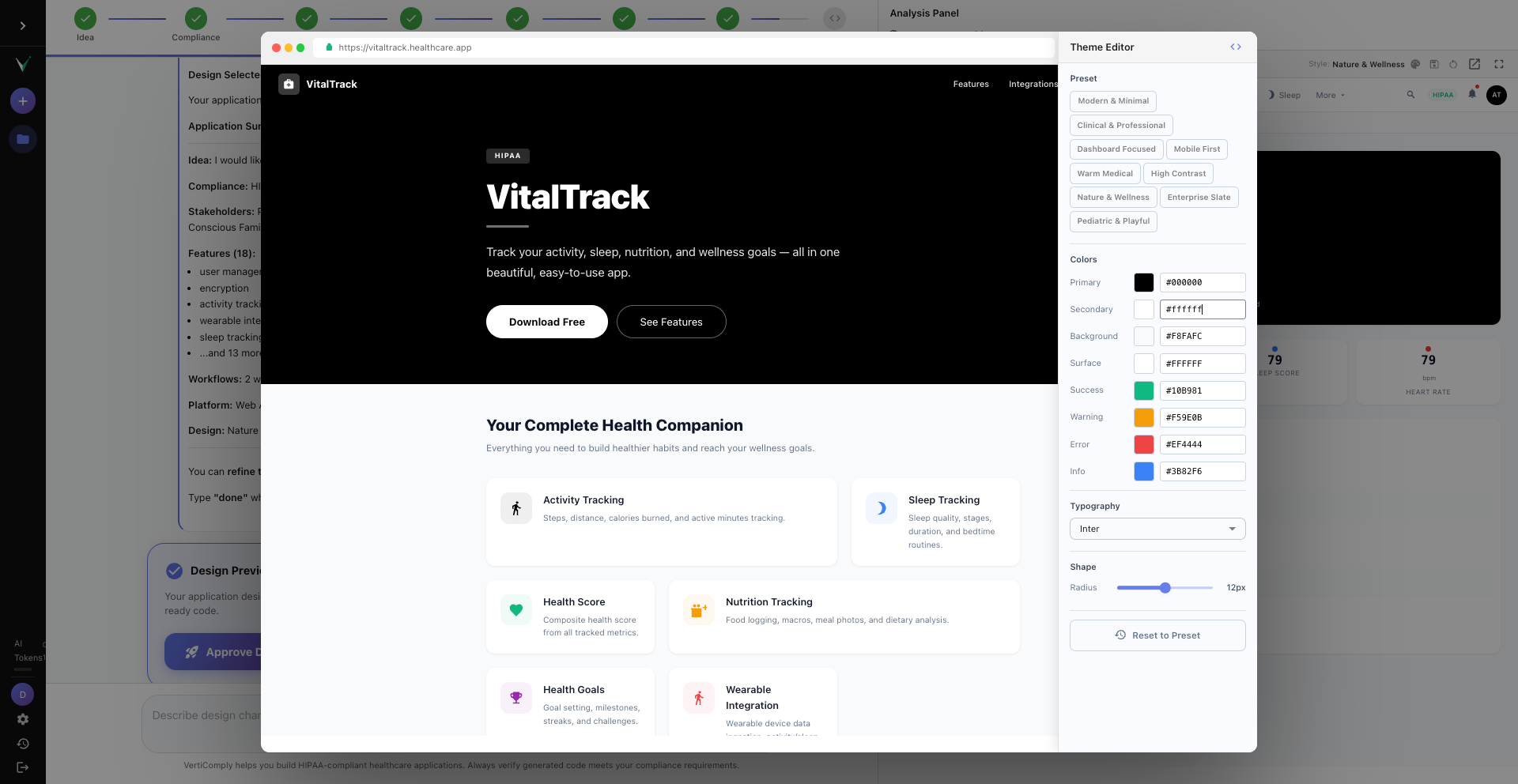
Theme editor panel showing color pickers for primary, secondary, background colors, font family dropdown, and border radius slider
Tip: The theme values are sent to code generation as exact hex codes and pixel values. What you see in the preview is what you get in the code.
Try different layouts
The preview supports multiple layout types: Classic Sidebar (most common), Top Navigation, Mini Sidebar (collapsed icons), Dual Panel, and more. The layout affects navigation placement and content structure. For healthcare dashboards, Classic Sidebar is usually the best choice.
Layout switcher showing Classic Sidebar, Top Navigation, Mini Sidebar, Dual Panel options with a preview of each
Check public pages
Your app also has public-facing pages — Welcome, Login, and Signup. The preview generates variants for these based on your app archetype. Switch to these pages using the navigation to verify the text, branding, and layout match your expectations.
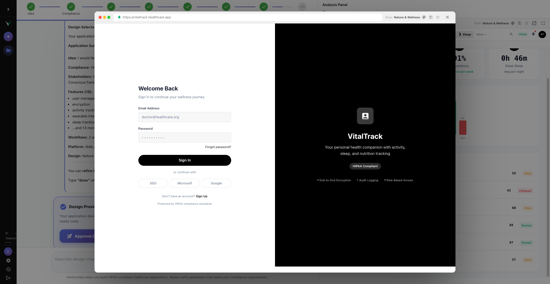
Preview showing the Login page variant with app name, tagline, login form, and branding elements
Review the compliance panel
Switch to the Compliance tab in the right panel. This shows a preliminary compliance report based on your selected standards — which checks will be run, what safeguards are expected, and the overall compliance readiness score. After code generation, this panel updates with real scores from code analysis.
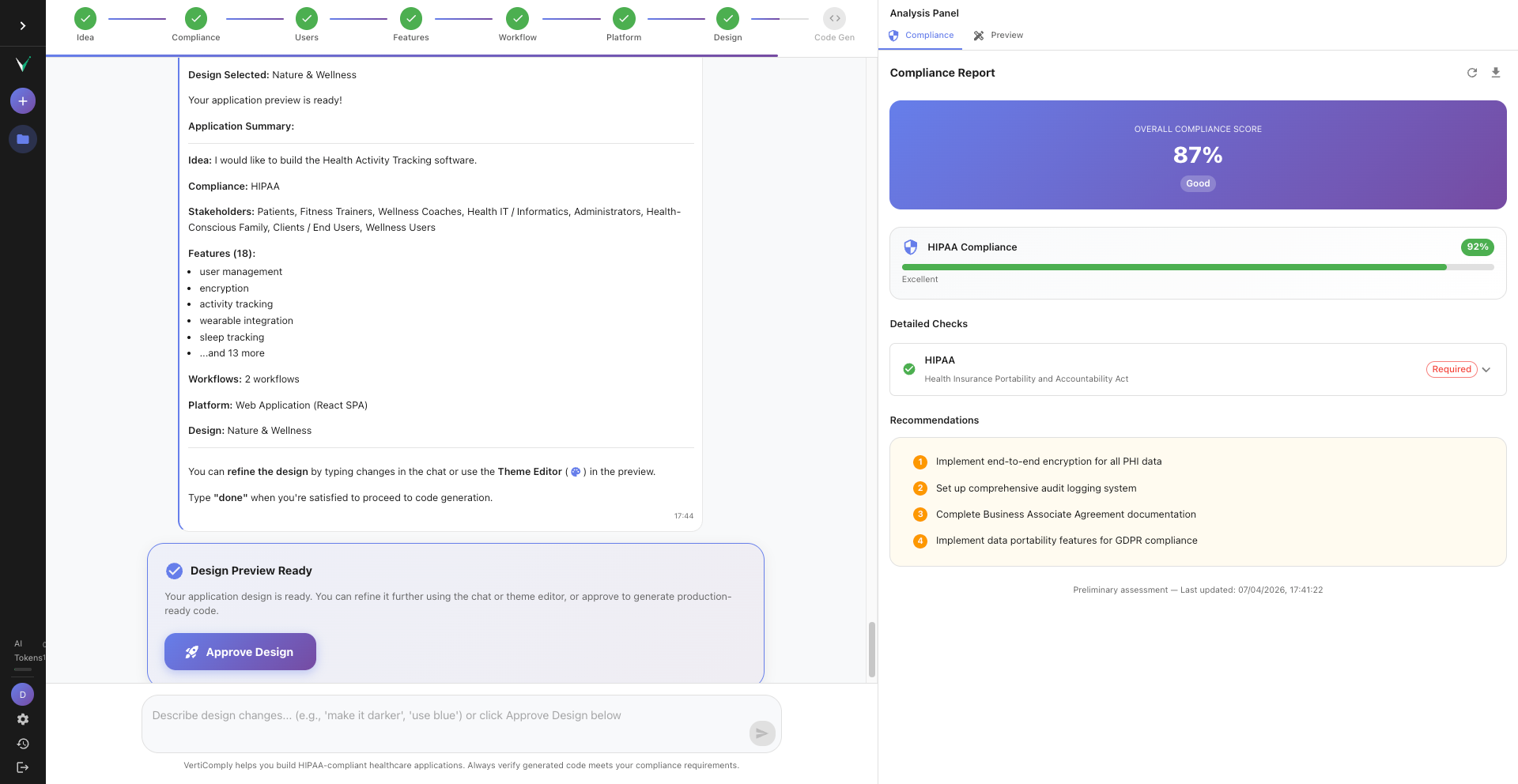
Compliance panel showing overall score of 87%, individual HIPAA and GDPR scores, and a list of compliance checks
Approve the design and generate code
Once you are satisfied with the preview, click "Approve Design" at the bottom. This triggers AI code generation. The system generates backend code (Python/FastAPI), frontend code (React/TypeScript), infrastructure templates (Docker, Terraform), and runs compliance validation on every file. You can watch the progress in real-time via the streaming progress panel.
The Approve Design button highlighted, with a streaming progress panel showing Backend generating, Frontend in progress, Infrastructure pending
Tip: Code generation typically takes 1 to 3 minutes. The preview becomes the blueprint — the generated code matches the page layouts, navigation structure, theme colors, and section types you see in the preview.
Previous
Create Your First Healthcare App in 5 Minutes
Ready to try it yourself?
Create your free VertiComply account and follow along with this tutorial.
Steps
01
Open the design preview
02
Navigate between pages
03
Switch design themes
04
Customize the theme editor
05
Try different layouts
06
Check public pages
07
Review the compliance panel
08
Approve the design and generate code
Details
Difficulty
Beginner
Time
8 minutes
Steps
8 steps
Category
Features
More Tutorials
Create Your First Healthcare App in 5 Minutes
5 minutes
Topics